Recently Next was awarded the construction of Campbell Arnott's Culinary Centre at their iconic head office site in North Strathfield which included a new 'Culinary Centre' featuring test and demonstration kitchens. This project also incorporated an employee breakout area with lounge, table seating and meeting spaces with the end goal of uniting staff within a common area for all in the facility to enjoy.
A major refurbishment of this scale, conducted in a live and operational environment, is a huge accomplishment. Entering into the design phase, morphing into construction, and subsequently completing and handing over the project all the while within a fully functioning facility is no easy feat. The results of the project show the intense planning, management and execution.

Contour cut Culinary Centre graphic upon entry made with glittery gold
As alternative light was recommended by Next, a confronting architectural challenge ensued. The extension endured Herculean works to support a monstrous glazed façade and roof to allow not only the first floor of the building to be supported, but the immense amount of glazing to empower such a volume of light into the area.
ScrimWorks were trusted to head up the graphics side of this project, and after a single site visit the light permeation was an obvious theme within the space – with a glass roof and glass walls there’s no way you can miss it!
Our challenge involved no such mathematics or consideration; the decision was simply to harness the light to improve an image. The images were our challenge.
Partnering both Campbell Arnott’s and Next, we were able to design and execute a heritage themed series of graphics paying homage to the businesses legacy, while acknowledging a modernised and technical space.
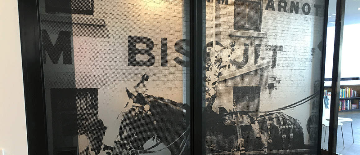
The glow of natural light permeating through the backlit material of the Operable Wall
For the “Operable Wall” (a fully mobile wall separating the new Culinary Centre and the Breakout Area), we decided on two heritage images from the birth of the businesses – horses and carts. Heritage photographs are typically difficult to work with due to resolution issues, however half toning provides unlimited potential. We used the same concept for the Breakout Area wall which you can see a video of below – however a blown up and half toned photograph of one of their original production facilities in Newcastle Australia, also with their team at the time lined up out front! A very rare image. This provided a stylised aesthetic, which brings the grassroots family aspects of the beginnings of the businesses forward into a new common area that everyone can enjoy in modern times.

Staff member 'crew photo' in a half tone design featured in the Breakout Area
There was also a feature floor graphic as part of the main Staff Area. Arnott’s suggested a vintage tin lid with a relic design on there from their archives, a very cool idea. We were very careful having this artefact professionally photographed by product photography specialist Roman Wolczak. The colours came up ultra vibrant after some quick re-touching at the ScrimWorks Studio, and we were ready to lay it down!

Professionally photographed antique biscuit tin for the floor graphic
Materials used were all top quality from Avery Dennsion, of course – ranging from a matte laminated backlit film for the Operable Wall (to give the light through the glazing a warm glowing effect), a matte laminated permanent SAV for the Breakout Area, and a permanent SAV with a special non-slip laminate for the floor, ensuring safety and a lasting finish.
Take a look at the photographs throughout the post, and take a look at the video to see ScrimWorks installation process for this project.